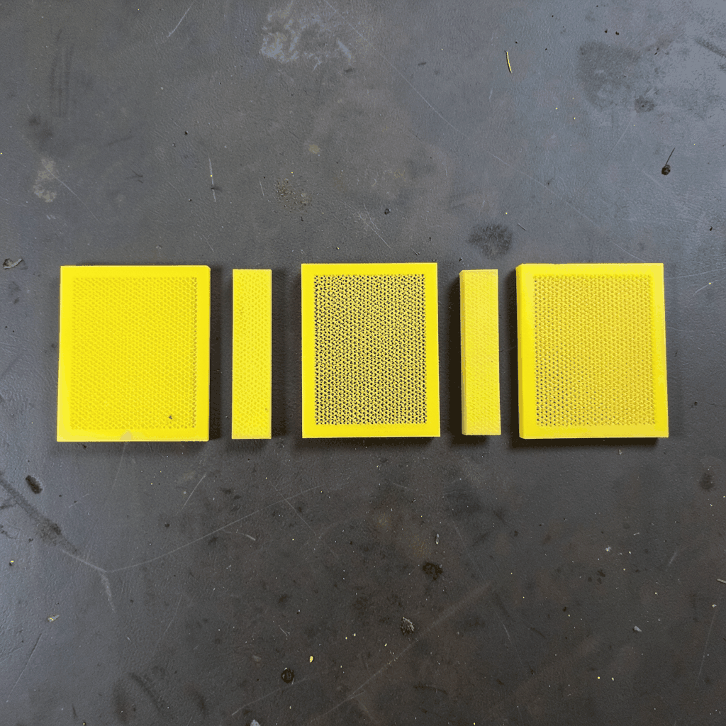
Custom laser-cut mesh for building signage and logos
Custom laser-cut mesh gives building brands a physical presence without the visual weight of solid metal signs. Logos, letterforms, patterns and symbols can be formed as precisely cut apertures, allowing light, shadow and airflow to become part of the identity. The result suits corporate entrances, apartment precincts, retail centres, schools, transport facilities and public spaces where a flat printed graphic can look temporary. It also works for interior directories, room identification and feature walls, creating a consistent architectural language across a project.
Australia’s climate and building culture shape the specification. Coastal sites in Sydney, Newcastle and southern Queensland need careful corrosion control, while Melbourne, Adelaide and Perth experience strong UV exposure and temperature swings. Brisbane projects may also need cyclone considerations, and bushfire-prone communities add another layer of risk assessment. Local councils, commercial landlords, strata committees and precinct operators often expect signs to fit both planning rules and a managed precinct aesthetic. Australian businesses also tend to use coordinated signage across shops, franchise networks, offices, warehouses and civic projects, so a logo panel may need to belong to a larger architectural family.
A capable manufacturer can turn that brief into a repeatable architectural system. Shuo Ke Wire Mesh Product Technology Co., Ltd. produces and processes metal mesh in stainless steel, aluminium, copper, iron and other alloys. Its range includes decorative curtains and partitions, wall and elevator cladding, laser-cut screens, fences, gates, guardrails, filters, baskets and barbecue mesh. This breadth is useful when a logo panel must share perforation, colour or framing with balustrades, screens and service enclosures, allowing architects, sign makers and builders to source coordinated components rather than unrelated accessories.
The strongest projects begin with a design brief, not simply a logo file. It should define viewing distance, panel size, mounting method, wind and corrosion exposure, lighting, maintenance access and the compliance pathway. Vector artwork should be reviewed for minimum web width, small-detail retention, corner radii and safe cut paths. Depending on the application, the team can compare a flat perforated sheet, folded tray, double-layer shadow panel or framed blade sign, reducing redesigns after council review, procurement or installation.
Design the identity for real viewing distances
Logos must remain legible at the distance most people encounter them while retaining their character at close range. A laser-cut panel can use a solid silhouette for bold wordmarks, open apertures for monograms, or a gradient of holes to create a photographic image. This flexibility makes the technique useful for wayfinding, façade identification and sculptural feature panels. The designer should test fine counters, narrow strokes and enclosed spaces before approving artwork because a striking file can become visually weak when enlarged or viewed obliquely.
The panel construction also determines how the brand is experienced. A flat sheet mounted close to a wall creates a graphic shadow, while a deeper return produces a more dimensional marker. Offset layers can create a halo effect, and a framed or folded panel can conceal fixings without losing the perforated face. For illuminated signs, light sources, diffuser materials and access points must be planned around the pattern rather than added after cutting. This is especially important in Australian retail centres and apartment lobbies, where bright daytime conditions can expose alignment and shadow inconsistencies.
Early visual testing prevents expensive surprises. A full-size paper or metal sample should be viewed from the approach route, across a forecourt and beside neighbouring materials. Teams can also compare perforation density, reflectivity and nighttime illumination. For sites around Melbourne CBD laneways, Brisbane transport corridors and Canberra civic precincts, a tested panel is easier for clients, precinct managers and approving authorities to judge than a flat screen graphic. It also supports clearer comparisons between options before the project locks into fabrication.
Choose materials for Australian conditions
Aluminium is often a practical choice for large architectural panels because it combines low weight with good corrosion resistance and machinability. The weight-conscious thinking in reducing panel weight is relevant to crews handling oversized panels on upper levels. Grades such as 5052 or 6063 can be cut, folded and finished in many colours. Perforations reduce stiffness, however, so edges, returns and rear frames may still be needed to keep a sign flat and secure.
Stainless steel offers strength and a premium appearance, but grade and location matter. Grade 304 is common for sheltered interiors, while grade 316 is a better fit for marine and coastal exposure. Mild steel can provide economical structural fabrication when adequately prepared, galvanized or powder coated. Copper and brass can create distinctive civic, hospitality or heritage effects, although their finish and runoff need review near salt spray. Designers should consider the whole assembly, not only the visible face, because fasteners and support steel can deteriorate faster than the panel.
The finish specification should match both appearance and exposure. Powder coating gives a broad colour range for architectural coordination, anodised aluminium offers a durable metallic surface, and brushed or patterned stainless steel can soften glare. Seal edges, isolate dissimilar metals and provide drainage so salt and moisture do not remain trapped behind perforations. For public buildings, assess relevant fire, bushfire and non-combustible requirements with the responsible designer; no generic finish should be assumed to satisfy every site.
Plan approvals before fabrication begins
Sign approval starts with the responsible local authority. Depending on the site, a council planning or development permit may be required for a freestanding sign, façade alteration or illuminated display. Building work and structures attached to a building may also engage the National Construction Code. Wind actions, structural members and illuminated signs may invoke Australian Standards such as AS/NZS 1170.2, AS 4100 and AS/NZS 3000, together with certification and local authority requirements. The pathway varies by state and council, so it should be confirmed before drawings are frozen.
Wayfinding adds another layer. Tactile characters, Braille and accessible routes may need to follow AS 1428 where signage forms part of an accessible building or transport environment; a decorative logo does not automatically satisfy those duties. Shopping centres, railway stations and airport operators often apply their own brand and technical manuals, including approved mounting zones and illumination levels. In everyday Australian retail settings, one store may be a franchisee, a tenant in a privately owned centre or part of a self-managed strata complex, each with a different approval process.
Contract documentation should make responsibility clear. Shop drawings, panel schedules, fixing calculations, finish samples, inspection plans and product certifications need to align with the consultant’s specification. The contract should also identify who handles template measurements, street occupation, traffic management, working at heights and final sign-off. In apartment or commercial precincts, records of approved colours and fixing details help future tenants maintain a consistent streetscape rather than replacing a branded panel with an unrelated format.
Coordinate fabrication with the wider project
Precision begins with usable production data. Vector artwork should identify fonts, spot colours and minimum apertures, while a shared coordinate system helps match adjacent panels. Fabricators can set cutting paths, bridges and radii around intricate logos, then use sample sections to confirm kerf, edge quality and dimensional accuracy. This matters for a long wordmark as much as for a corporate mark. A photograph converted into perforations also needs tonal testing because clipped highlights and blocked shadows can change the perceived image.
The mesh can remain a standalone sign or become part of a wider architectural assembly. Shuo Ke’s decorative curtains and partitions, wall and elevator cladding, laser-cut screens, fences, gates and guardrails can carry a repeated pattern selected by the project designer. Perforated metal can define a foyer backdrop, conceal plant or services, and preserve visibility where a solid wall would feel heavy. This approach is particularly effective in Australian offices, hospitality venues, industrial campuses and residential developments where branding, privacy and spatial identity overlap.
Quality control must cover the complete system. Square cuts, flat panels, smooth welds, consistent coating and safe edges all affect appearance, but fixings, drainage, gasket compression and replacement access determine long-term performance. Modular sizing lets one damaged panel be removed without dismantling an entire façade. Where a sign sits above a public path, edge treatment and anti-fall provisions should be detailed rather than assumed. Clear mock-ups and approved samples also give the installer a measurable standard on site.
Practical choices for a durable signage system
A reliable signage outcome depends on early decisions and coordinated documentation. The designer, manufacturer, builder and approving authority should work from the same dimensional and environmental brief. A considered specification reduces cost changes and gives the finished mesh a clear role in the building rather than leaving it as a last-minute graphic layer.
- Start with site and brand constraints: record viewing distance, panel size, colours, logos, mounting zones and nearby materials before artwork is released.
- Match the alloy to the microclimate: select a suitable grade, finish, edge treatment and isolation strategy for coastal, inland, urban or cyclone exposure.
- Specify the entire assembly: include supports, fasteners, drainage, lighting, access, replacement modules and safe edges rather than detailing only the face sheet.
- Test, document and maintain: approve a physical sample, confirm tolerances, retain compliance records and schedule inspections so the signage remains legible and secure.
Bring the logo, panel schedule, site locations and preferred finishes to Shuo Ke Wire Mesh Product Technology Co., Ltd. for a custom quotation and production discussion. The team can advise on material selection, perforation strategy, fabrication tolerances and packaging for delivery to Australian project teams, helping move the concept from a verified sample to a coordinated building component with confidence.